
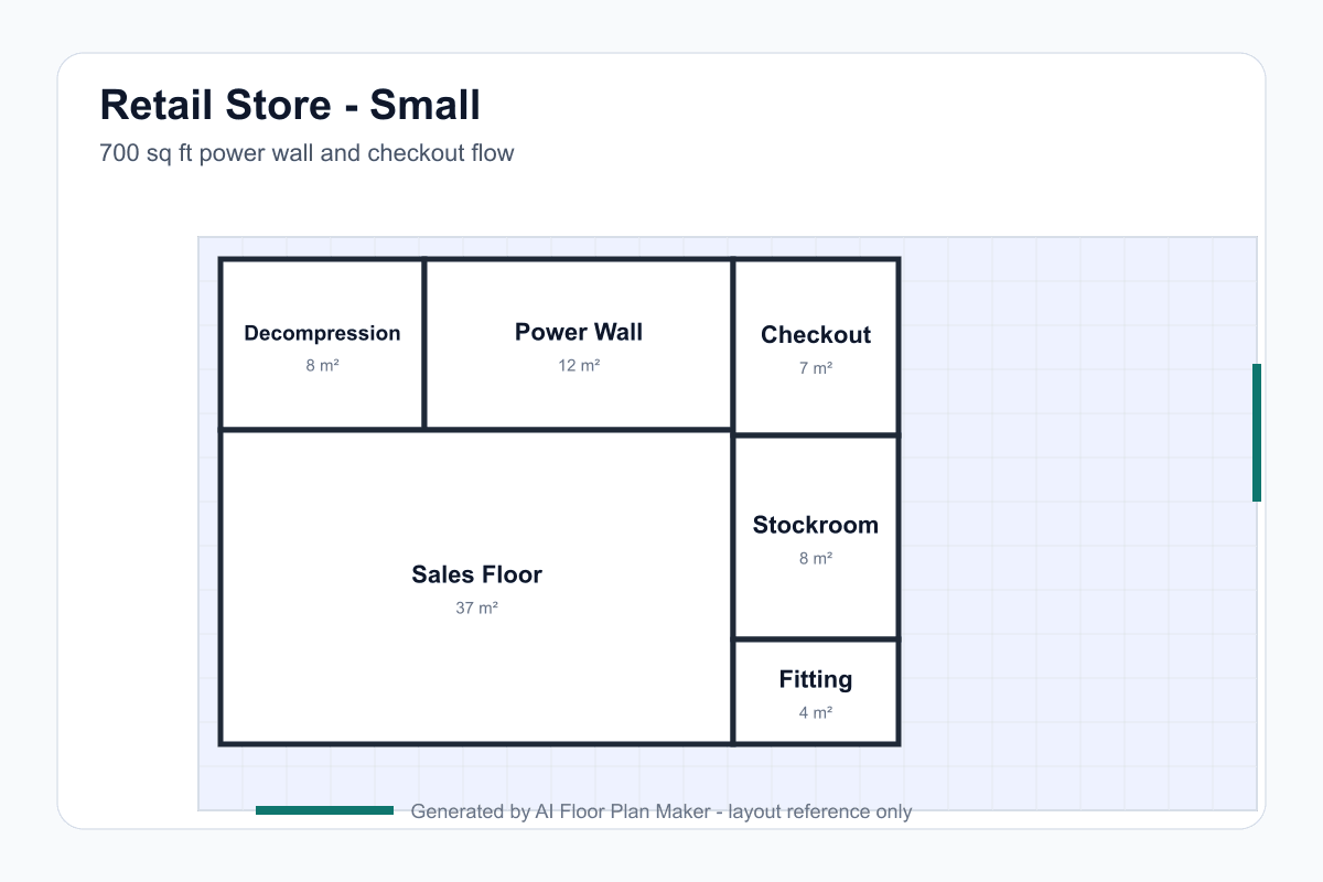
Small retail store — 700 sq ft boutique layout
A compact shop plan where the entry zone, power wall, checkout, stockroom, fitting rooms, and sales floor all need to earn their space.
Retail planning tool
A retail store floor plan is not just a shelf map. It is a route for how customers enter, slow down, look right, explore, try, buy, and leave. The first few meters after the entrance are the decompression zone, where people adjust to the room. The right-side power wall often carries the strongest visual message. A racetrack loop can help shoppers see more products without feeling forced. When the path is longer, clearer, and more comfortable, customers usually discover more merchandise and make better purchase decisions.
These examples show how a retail store floor plan generator turns merchandising strategy into a visible layout. The small store keeps the power wall and checkout close without crowding the entry. The medium store uses a clearer loop so shoppers can browse before they reach fitting rooms and checkout. The large store gives more space to feature displays, customer circulation, stockroom access, and a deeper fitting area. Use them as planning references before measuring fixtures, lighting, security, signage, and exact SKU capacity.
A compact shop plan where the entry zone, power wall, checkout, stockroom, fitting rooms, and sales floor all need to earn their space.
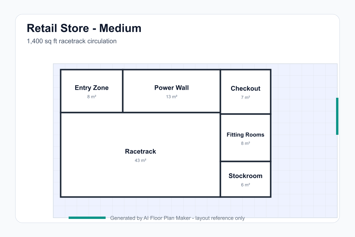
A neighborhood retail concept with clearer loop circulation, a strong right-side display wall, practical checkout placement, and deeper fitting room support.
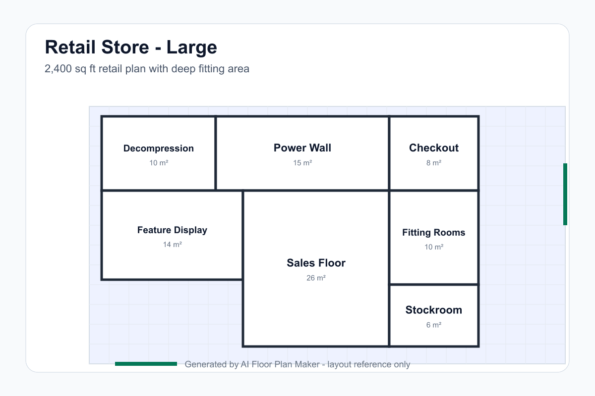
A larger store study where customer path length, display hierarchy, fixture density, fitting rooms, checkout, and back-of-house access need to be planned together.
The first 1.5-4.5 meters after the entrance is where customers slow down, orient themselves, and adjust from outside to inside. Keep it open and avoid placing the most important products there.
Many shoppers naturally turn right after entering. The first major wall on that side often becomes the power wall, a high-impact display zone for new arrivals, best sellers, or seasonal stories.
A main path of about 1.8 meters supports two-way movement, browsing, bags, strollers, staff assistance, and accessibility. Narrow aisles can make the store feel cheaper and more stressful.
A racetrack or loop path helps customers see more merchandise before they leave. The goal is not to trap people; it is to make exploration feel natural and reduce awkward backtracking.
Checkout often works on the left side or toward the middle-back of the route, where customers arrive after browsing. If it sits too close to the door, it can interrupt entry flow and waste display value.
For apparel, fitting rooms should sit deeper in the store near the clothing zone. Include hooks, seating, mirror logic, staff visibility, and a return path for tried-on items.
Stockroom doors should be easy for staff to reach but should not dominate the customer experience. A good plan keeps replenishment practical without exposing back-of-house clutter.
More racks do not always mean more sales. Leave enough room for turning, viewing, and comparing products. Crowded fixtures can reduce dwell time and make premium products feel discounted.
Retail planning overlaps with hospitality when customer flow, dwell time, and service points matter. For a queue-heavy layout, compare the coffee shop floor plan generator. For a more operational food-service layout, review the restaurant floor plan generator.
Enter the approximate area, product category, customer path, fitting room needs, checkout style, stockroom size, and any pickup, returns, or service counter requirements.
Check whether the entrance has breathing room, whether the power wall is visible, whether the racetrack path feels natural, and whether checkout sits at a logical endpoint.
Move walls or zones, compare alternatives, open the 3D preview, and download a PNG before you refine racks, shelves, lighting, signage, POS, security, and product capacity.
Yes. It is especially useful for early planning because small retail stores need disciplined zones: entry, power wall, display, fitting rooms, checkout, storage, and staff space. The generated plan helps you see the tradeoffs before you buy fixtures.
Yes. Mention fitting rooms, checkout, stockroom, feature display, power wall, service desk, or pickup counter in the prompt. The generator will produce a layout preview that separates customer circulation from staff and storage needs.
The decompression zone is the first area after the entrance, often about 1.5 to 4.5 meters deep depending on store size. Customers use it to adjust to the store, so it is usually not the best place for your most important merchandise.
No. Treat it as a layout reference only. Accessibility, fire exits, fixture anchoring, electrical loads, security, local building codes, and lease restrictions must be verified by qualified professionals.
It can help with early merchandising strategy by showing the entry zone, power wall, racetrack path, checkout location, fitting room relationship, and storage access. Detailed shelf heights, SKU capacity, lighting, and planograms should be refined later.
Start with a text brief, test the shopper route, and bring a clearer plan to your next lease, merchandising, or fixture conversation.
Open the floor plan generator